Building real Mobile Websites with Drupal
There are tons of articles and discussions about advantages and disadvantages of responsive and adaptive web design but this article won't get into that. This is just about the mobile web site I want to get, and how to build it with Drupal. Keep in mind there are plenty of options about how to build a mobile version of your web site. Possibly most of the people will be just fine using one of the many responsive themes that there are available. They work just fine.
But the thing is I want a fully different version of my web site for mobile devices and I want the kind of consistency on which a URL matches exactly to a web site page. Also I've been checking a number of top web sites, mostly from content publishing companies and guess what... most of them have a specific mobile version of their web site (That's adaptive by the way), using a different domain for mobile. Well, I want more or less that, built with Drupal, of course.

So how can I build a clean / powerful / simple mobile version of my web, that won't require a different web site, thus it runs with the same content, but still allows full control of options for a mobile device. These are my requirements or, in other words, how I think a mobile website should work:
- Different URLs for different versions of the page, that allows user switching and proper indexing by search engines.
- Automatic redirection depending on device, though the user must be warned and have the option to switch back.
- Both mobile and standard version can be accessed with any device.
- Full control of theme, blocks, display, etc for the mobile version.
- Performance: Page caching must work just fine, no core hacks, just regular Drupal caching using url.
- Let's save bandwidth and battery life or Do not deliver to a mobile device the full ton of markup they're not going to see.
- No Javascript trickery for image / content loading. HTML is HTML, content is content, and images are part of that.
Or in short, since Drupal provides us with, up to a point, nice separation between content and presentation I want the full control of the presentation for both standard and mobile web sites.
When searching for Drupal modules for this purpose, I couldn't find the right combination of modules. There are plenty of mobile_xxx modules, but none of them really allows for the kind of options I want, and just a few of them have a released stable version. So I've figured out I can use some of them for my purpose, but I'd need also to build a few custom ones. And this is how I've implemented it, for which I've built my own collection of simple modules you can find on my sandbox, each of them with a very specific purpose.
Getting multiple domains
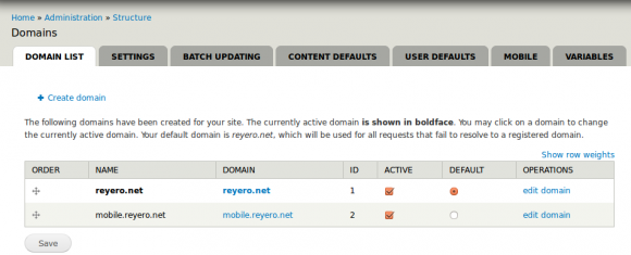
As I want to have my own standard and mobile domain, there's already a Drupal module that's allows a great deal of flexibility for serving different domains from the same site: Domain Access.
Just by enabling Domain Access, I can have two versions of the site running on different domains, can set a different theme for each, and customize them up to a point.
Moreover, there are lots of other modules that integrate well with Domain Access, so this provides really way more options than the few described here.
Redirecting to the right version
Now we need each domain to be aware of the other and we'll need something else for switching/redirecting between them. These two modules will do that:
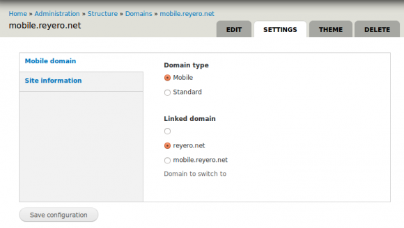
- Mobile Domain, which provides two variables, one for which type of domain is each of them and another one for keeping the alternate domain. This can be configured nicely with different variables per domain (we must select these variables as 'per domain' manually though, sorry but this was faster than writing a proper install script).
- Mobile Domain Switch, that will do automatic switching between domains depending on the device, while still providing the user with options to switch back to the other domain. These modules rely on Browscap to redirect each device to the right version.
Note at this point we've reduced the standard vs. mobile web site to having two different domains we can set up independently, but that's up to a point. We may still want more options and flexibility.
Full control of presentation
Now we have different themes for each version, that gives us also the power of configuring blocks for each of them separately, which is nice.
I want my desktop version to present a few posts and a block listing a few more, and I want my mobile version to present a plain list but with a different format and a bit longer, since there won't be a side block for seeing other posts. There is a setting in Drupal for controlling that, 'Number of posts in main page' so all I need is to switch this variable value for each of the domains.
Then, for a teaser list, like the one on the front page, we want to configure the presentation differently for each version. I've needed another module for this that does exactly that: Provides a 'Mobile teaser' and a 'Mobile full' display modes and for any other display module, it will use an alternate one with the 'mobile_' prefix when it exists.
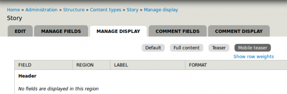
Nice, now we can deliver properly sized text and images for each version of the site.
How to tell search engine crawlers
I guess they want to know, and we want them to know, that they are getting two alternate versions of the page. The Mobile Domain Switch module will take care of this too, and will add, on the mobile version something like:
<link rel="canonical" href="http://reyero.net/" >And on the desktop version:
<link rel="alternate" media="only screen and (max-width: 640px)" href="http://mobile.reyero.net" >What about 'Mobile variables'?
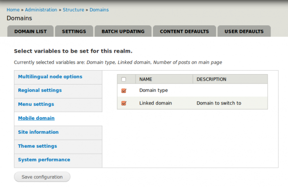
By using the extreme flexibility of the Variable module we cannot only have different variable values per language, but we can also have different values for each domain, that's the Domain Variable module I've talked about some time ago. That would kind of fix our problem when using different domains for mobile and desktop, but also we can have a set of variables that apply only to mobile domains or standard domains, and this is what I've also built in my sandbox.
(I have somewhere a Variable module that depends only on Browscap, though I'm not using it finally, it should be somewhere in my sandbox..)
On top of all this you can also have a responsive theme. Responsive themes don't usually make the difference on whether a device is mobile or not, but on the screen size, and that is also good and it was good even before mobile devices. So there's no reason why you cannot use a responsive theme for mobile or desktop devices of multiple sizes.
Well, this site is an example of all these modules I've talked about so you can check it out. The theme is not beautiful but works. Oh, and note the language switcher in my mobile theme displays only one language, the one you can switch to, that's advantages of having a different mobile theme.
Have fun, feedback would be appreciated, specific questions about modules are welcomed on that module's issue tracker and please, remember sandbox modules are not for production sites unless they are your sandbox modules.
Update 2014-05-29: Promoted the mobile_domain sandbox module to provide a downloadable file (development version).
Update 2017-01-01: Updating this site's design, not using mobile site anymore.